COVID-19 U.S. Dashboard
Client: PersonalServices
- UI Design
- UX Design
- UX Research
- Front-End Development
- Graphic Design
- PHP Programming
- HTML and CSS
- JSON Parsing
The Problem:
The COVID-19 tracking project was started in early March 2020 to help track the progression of COVID-19, largely for myself.
The Challenge
In my lifetime, we’ve had a few national and global health scares: SARS in 2003, Swine Flu in 2009, and the Ebola crisis in 2014. In all those cases the crisis was largely under control and the idea of them becoming massive epidemics were possible, but not likely. Coronavirus, more specifically COVID-19, was something else. As I saw what it did to China and the impact in Washington state, I wanted to get information in a way that made sense to me.
Following the lead of the successful Johns Hopkins COVID-19 tracker, I decided to also use my new downtime due to the Stay At Home orders that were in place to learn more coding than I had before.
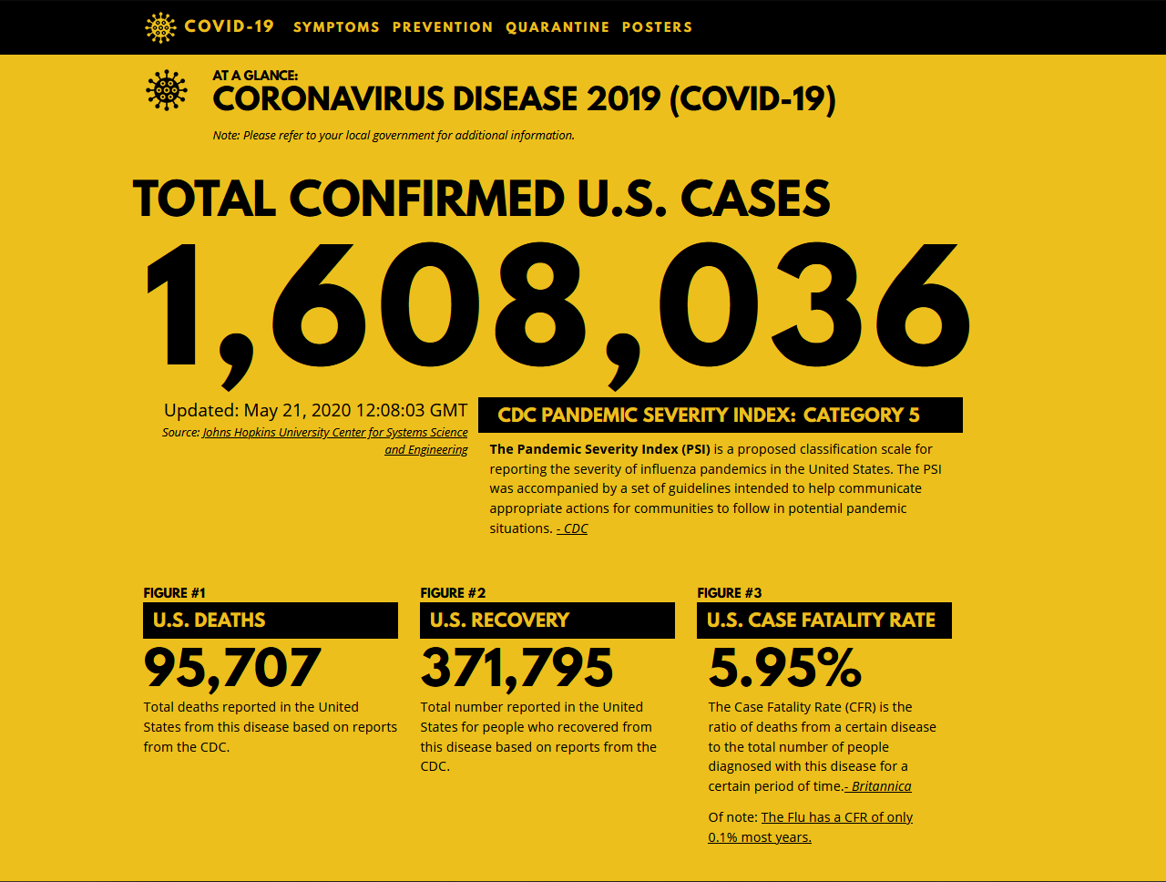
Over time, though, the focus had to change. Instead of focusing on the need to learn about the disease, it became all about the statistics and trends. What did the rise in cases look like? How do you present that to people? And how do you show the new daily cases? There was also the morbid task of the top section: I never imagined the United States getting more than a few thousand cases, so it was designed to show a massive number at the top. As time went on, I realized I had to allow for tens of thousands, then hundreds of thousands, until it went into the millions.
The Solution:
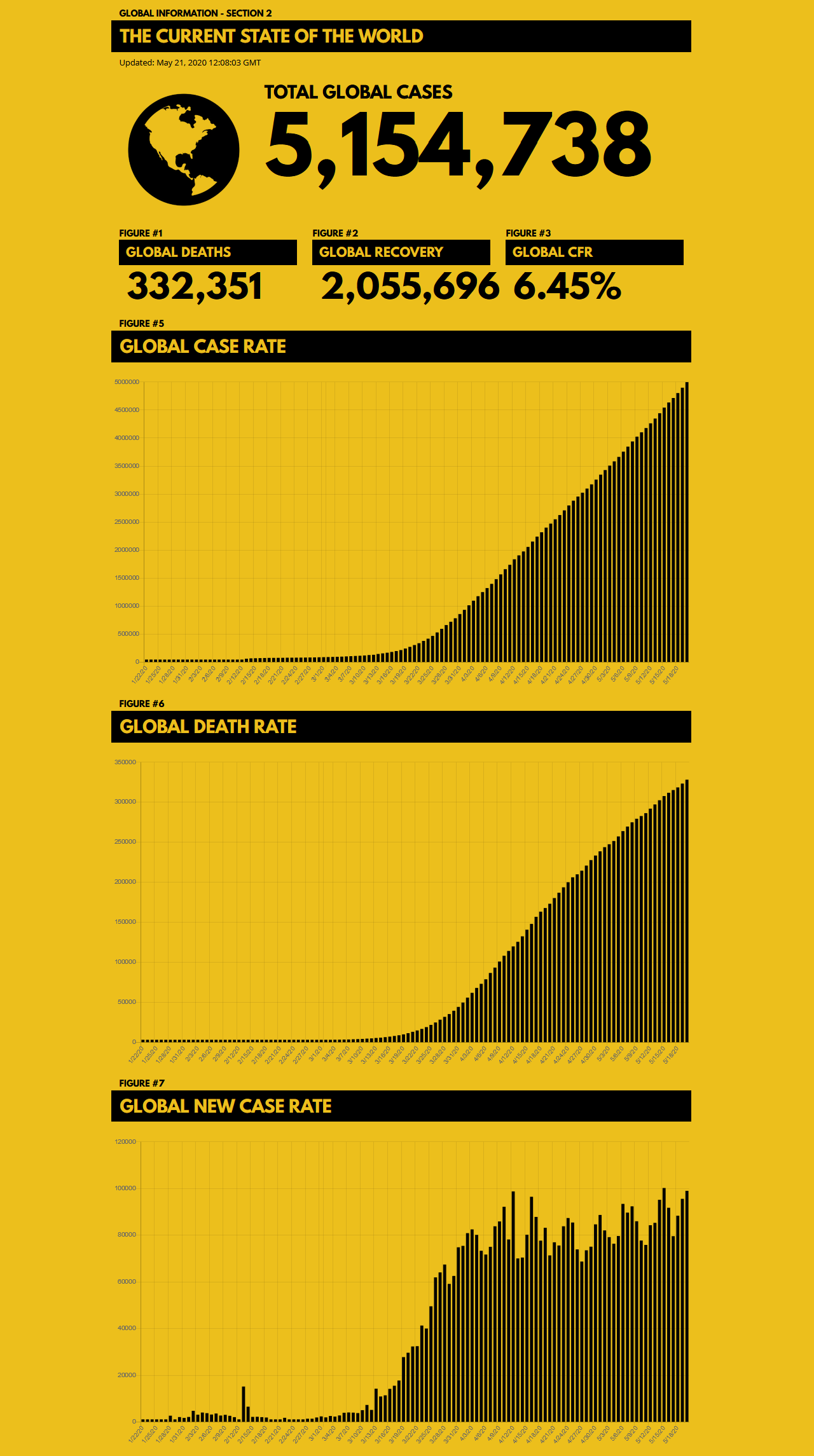
Combining my flare for eye-catching design and my knowledge of coding, I found an API that had real-time updates of COVID-19 case numbers and statistics. I did a JSON call of the data and used PHP to get the information I needed in a way that made sense to me. Working with a few developer friends, we were able to implement JS Charts using the data as well.
I created wireframes in Adobe XD to layout all the sections and determine the most important thing for UX was to have users confronted with the number of new cases and distilling the information from there.
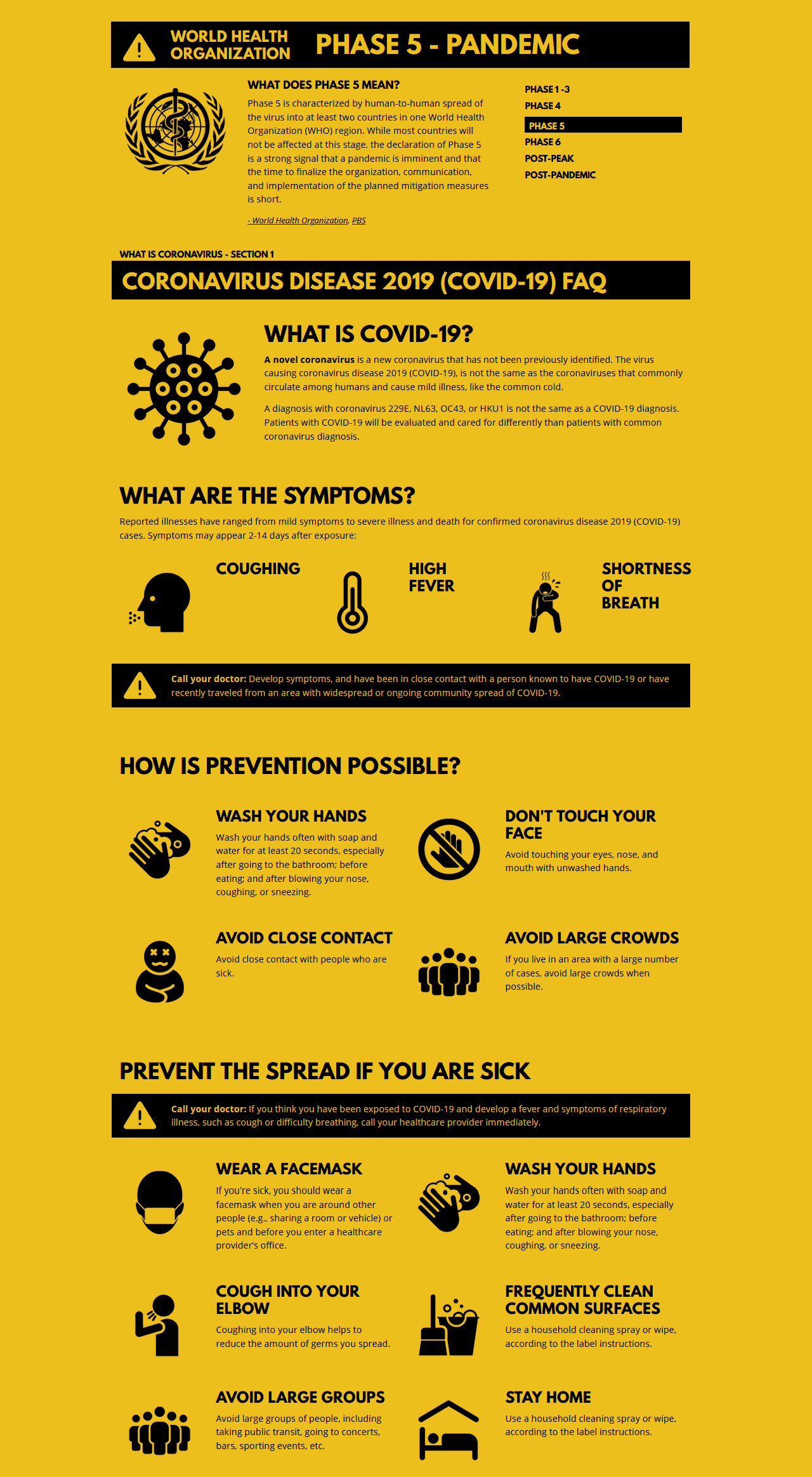
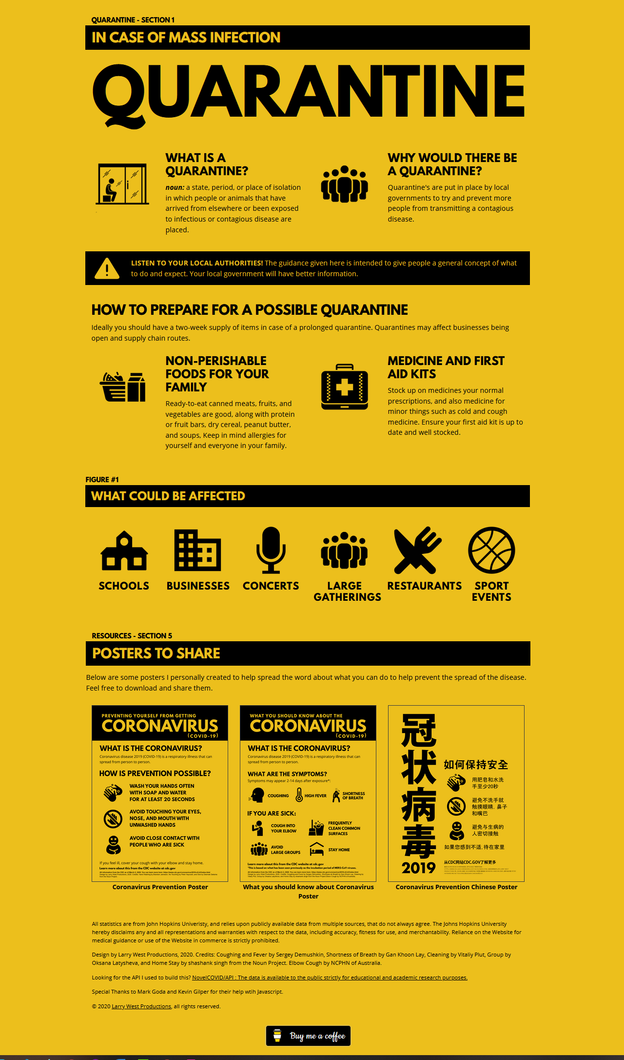
The original design of the project focused more on informing people about COVID-19 prevention, warning signs, and posters to put up to warn others of the dangers of the virus and how to protect themselves. I stuck with a yellow-and-black color palette for everything as the simplicity of the colors were perfect and borrowed heavily from past quarantine posters in the last 100 years.
The Results:
I got a lot of great feedback on this project, with people saying it was easy to use and not as overwhelming as a few other dashboards.
Visit the Site